2023-2024 / Mexico / BBVA
From a stalled product to a financial experience that connects with teens
My role
Senior Product Designer
My contribution
Strategic design
Team leadership
End-to-end coordination
Overview
We turned a stalled account into a digital experience designed around the emotional and family context of teenagers.
We questioned the initial business hypothesis, redefined the product vision and built a shared experience between parents and kids.
My role was to lead the strategic transformation from design: articulating a shared vision, holding firm on hard decisions in the face of internal resistance, structuring a growing team and translating insights into actionable, measurable features.
The result: +1 million new accounts opened after launch.
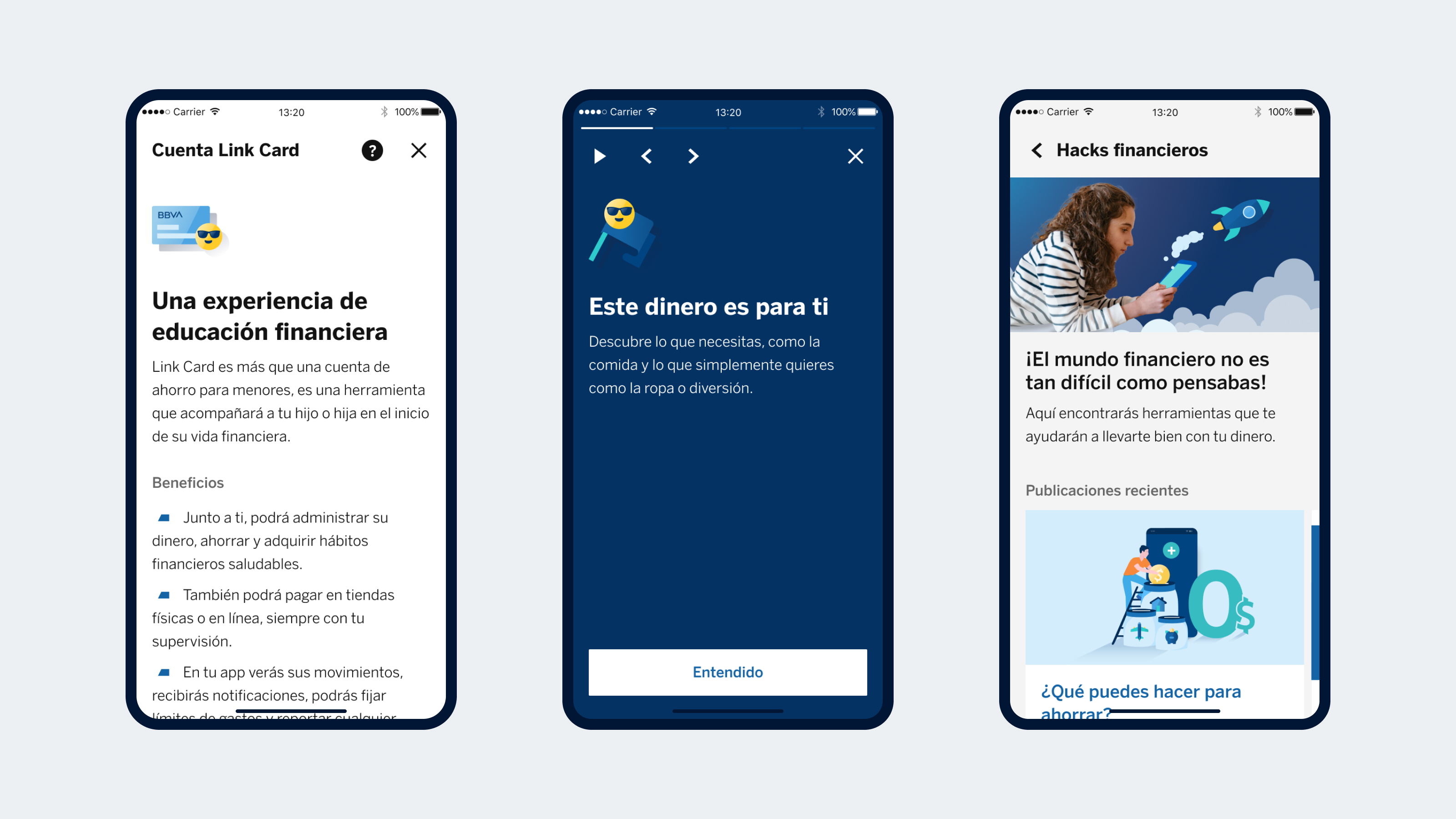
Problem space
A product that stopped making sense to its users
The bank already had an account for minors, a simple savings account parents could open for their kids.
But the product had lost traction:
Sign-ups had dropped 30% since 2020.
56% of users were adults who hadn’t migrated to another product.
Only 1.56% of minors used the app.
The most frequent expenses were on utilities, pharmacies and gas stations, categories with little relevance to minors.
The business hypothesis was that we needed to add adult-account features to the product to make it more appealing.
Uncovering the real needs and barriers
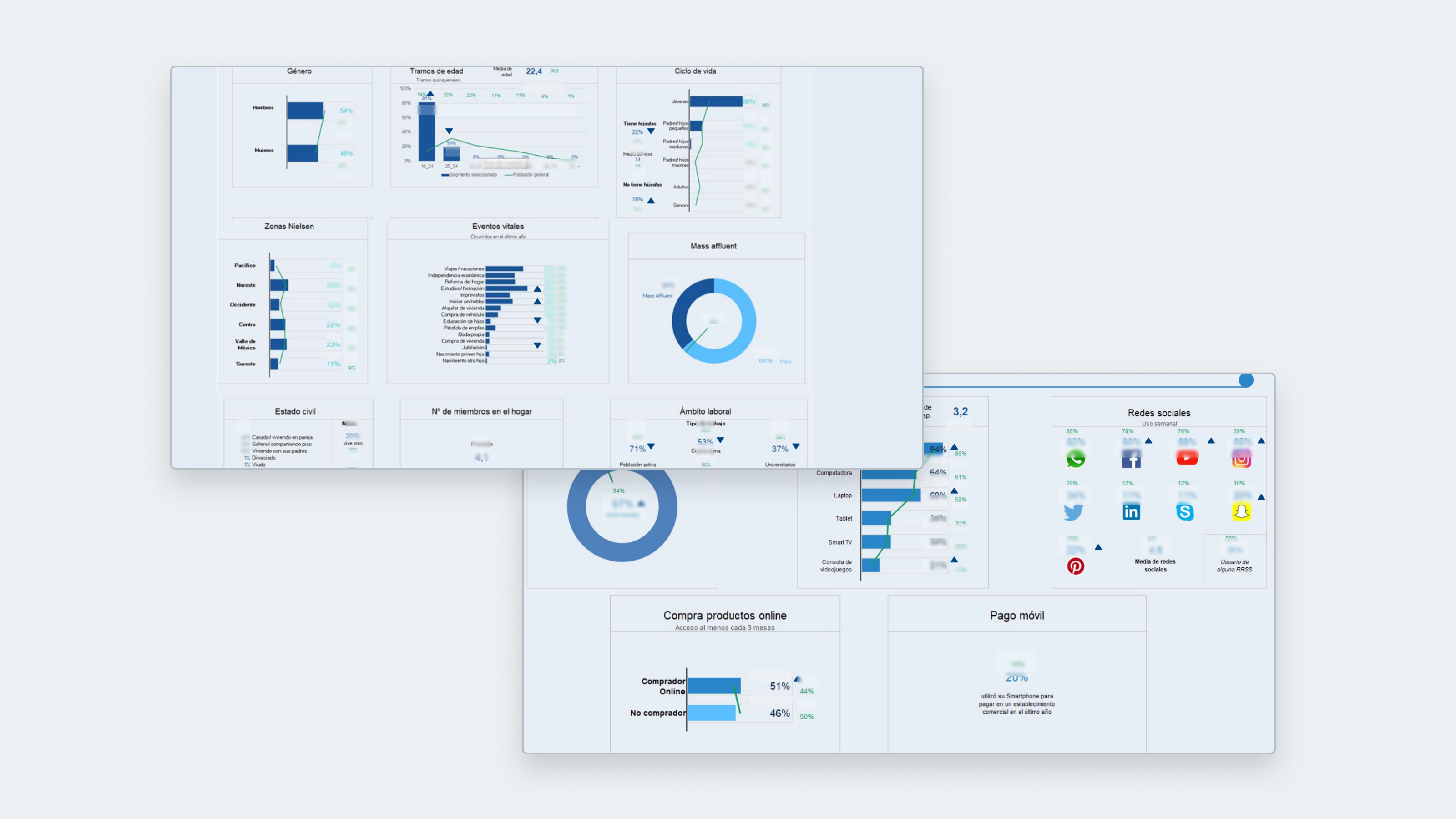
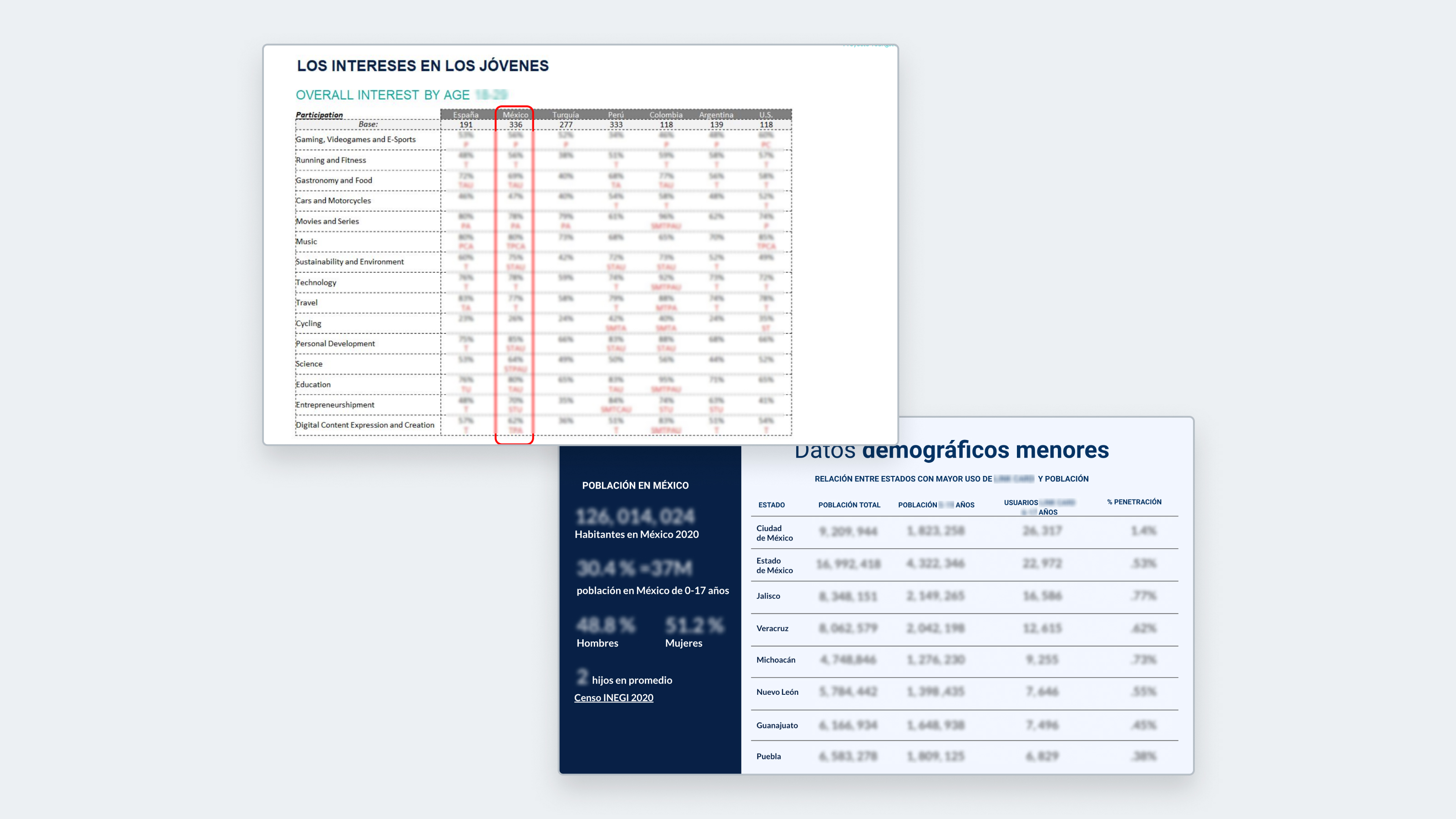
We analyzed data, ran a competitive benchmark and audited the current experience.
Then we interviewed 6 families (parents and kids) and 3 young adults who had used the account. We explored financial habits and family dynamics around money.
Some key findings:
Parents
- Want to teach their kids about money, but lack structured tools or knowledge
- Use homemade strategies (challenges and rewards) to teach financial habits
- Prioritize safety, which is why they limit how much money they hand over
Minors
- Handle limited, variable amounts of money with little ability to plan
- Don't use the app, which erodes control and trust in the account
- Want to save, but struggle to plan ahead and stay motivated
Key insight
Minors aren’t miniature adults. They need an account that understands their context, not one that forces them into one that doesn’t fit.
Solution space
Reframing the problem to redesign the product
We questioned the business hypothesis and proposed a new vision: it wasn’t enough to add features — the product’s purpose needed to be redesigned.
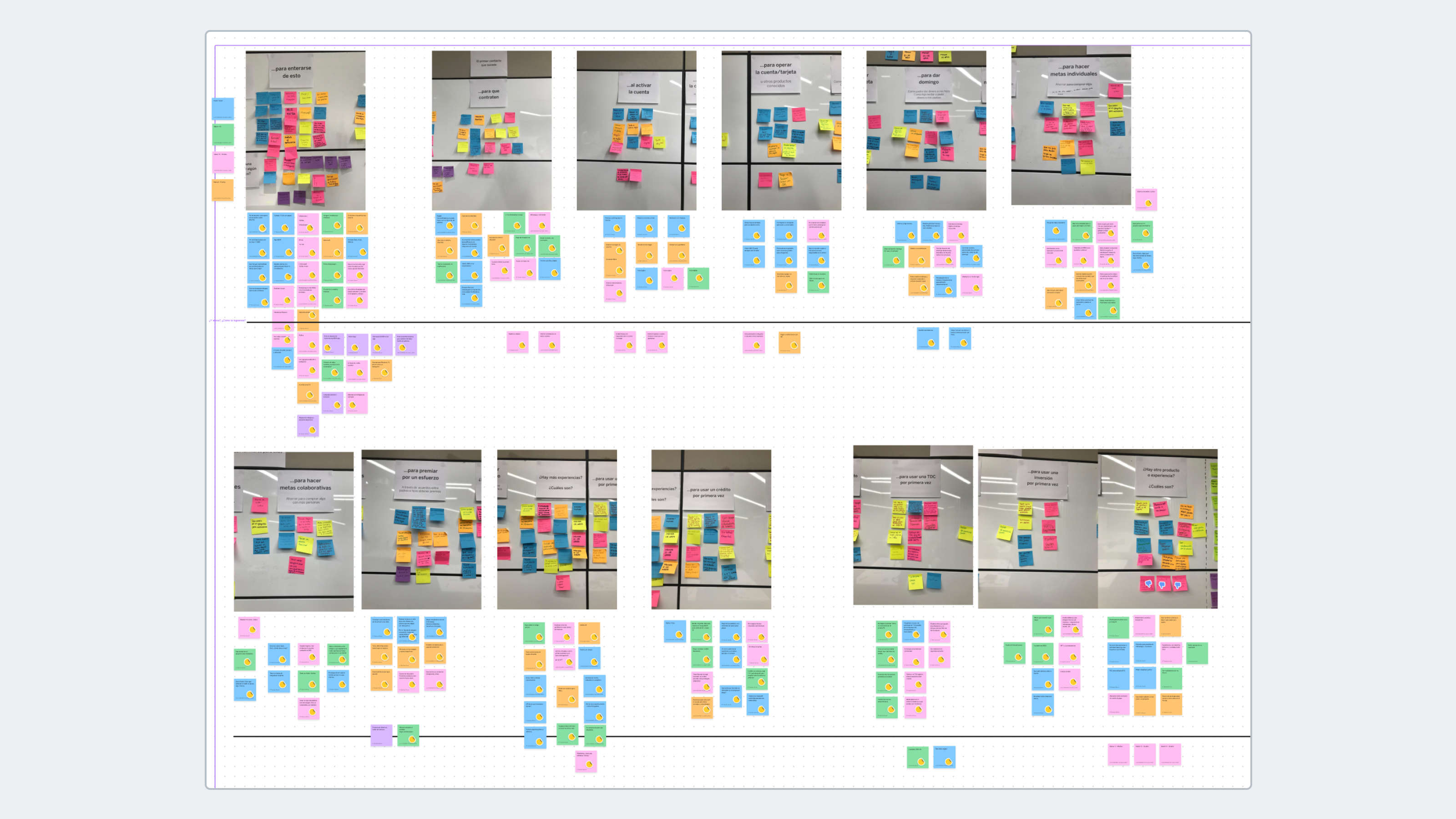
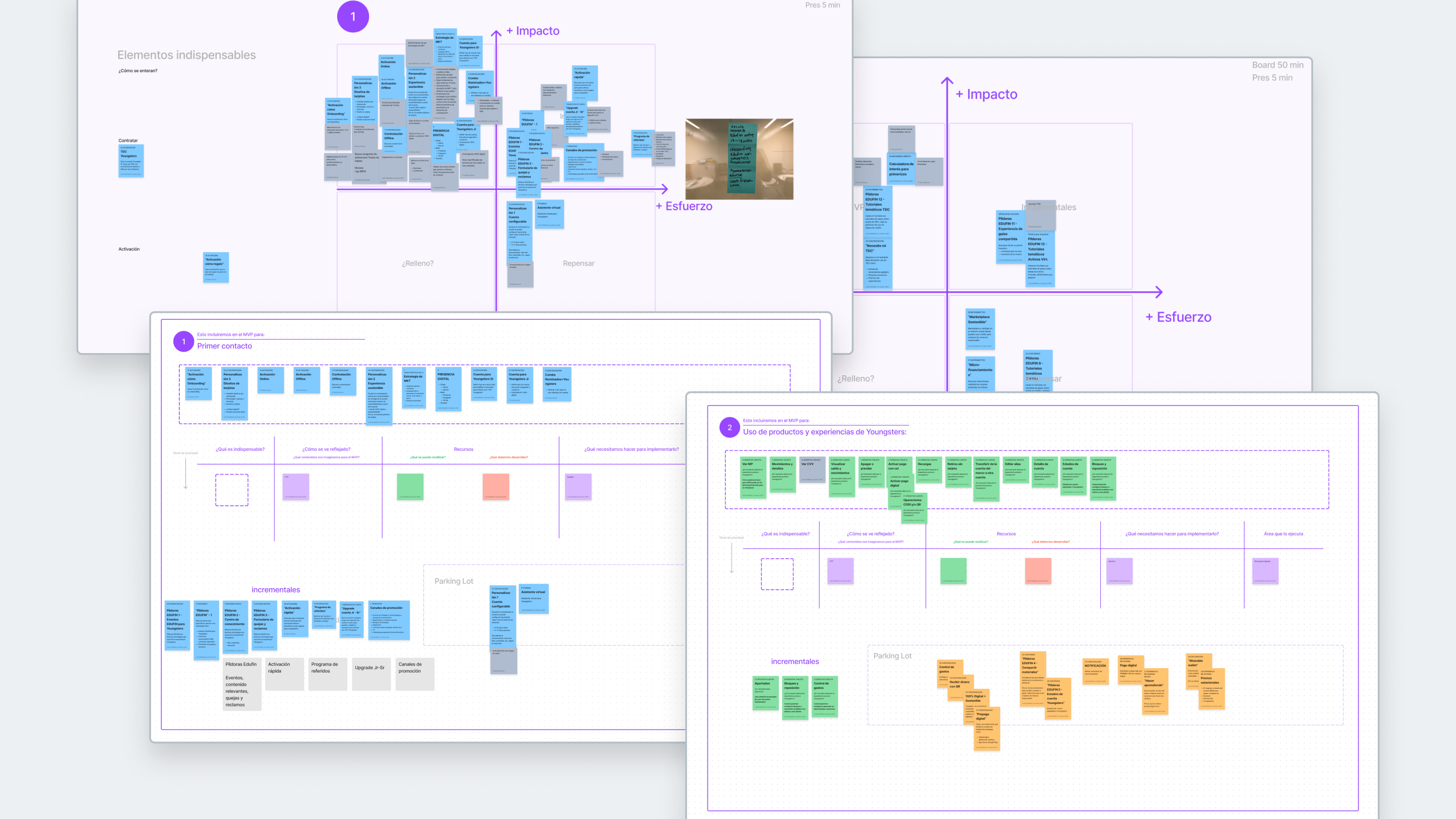
I facilitated a co-creation workshop with stakeholders to align vision, insights and opportunities.
In two days we reoriented the project:
Day 1
Presented findings, identified opportunities and weighed future scenarios
Day 2
Defined the MVP, prioritized features and agreed on a roadmap
A new value proposition
A safe space where teenagers can learn to manage their money, build good financial habits and grow their autonomy alongside their parents — building a positive relationship with money and with the bank.
Built on 4 strategic pillars:
Spark family conversations about money
Enable shared experiences, not just supervised ones
Build saving and planning habits
Empower with a digital experience suited to their age
A functional experience, not just a digitized one
The accounts product team questioned whether the proposed features were truly necessary or just nice-to-have: there were adult-account operations that “already worked” and required less development effort.
—“Why build something new if we already have something that works?”
I argued from behavior: our research had identified barriers blocking the business goals:
01
Parental distrust
Parents worried their kids would become 'spenders' and preferred to keep close control of cash
02
Low money-management capacity in minors
Without funds in their accounts, minors wouldn't get the feedback needed to learn to plan spending or save
03
Compromised financial education
By adulthood, they'd have no established financial habits or prior experience managing their own money
04
'Upgrade' path to credit products
Without good financial behavior or a track record, they couldn't quickly access active products like credit cards or loans
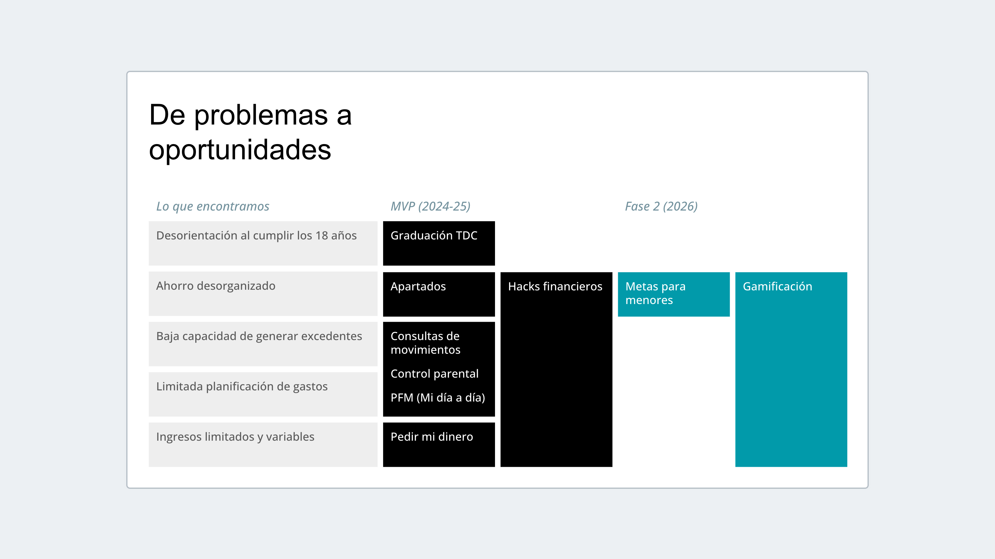
I cross-referenced these barriers against the adult-account features to expose the gaps. More than specific features, I found key needs to solve for:
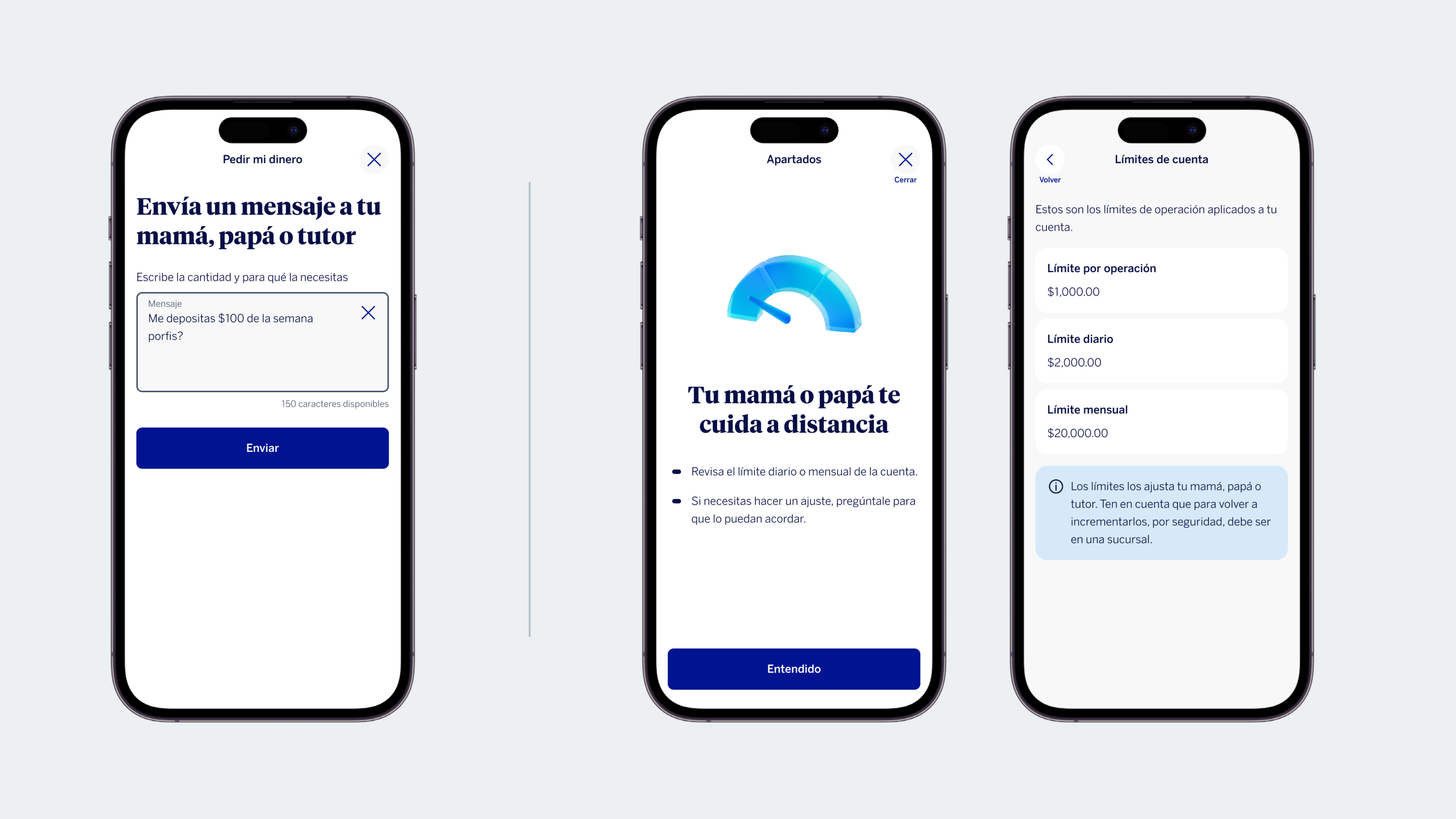
Differentiated roles, not a standard account
Security and oversight for parents, planning and autonomy for minors.
Both roles needed to 'talk' to each other
Without mirroring or handing control to the parent. This was the hardest part: the bank's architecture didn't support 2 roles on the same product.
Balancing adapting vs. building
To keep negotiations viable, we aimed to maximize reuse without breaking the vision.
Holding the vision beyond the MVP
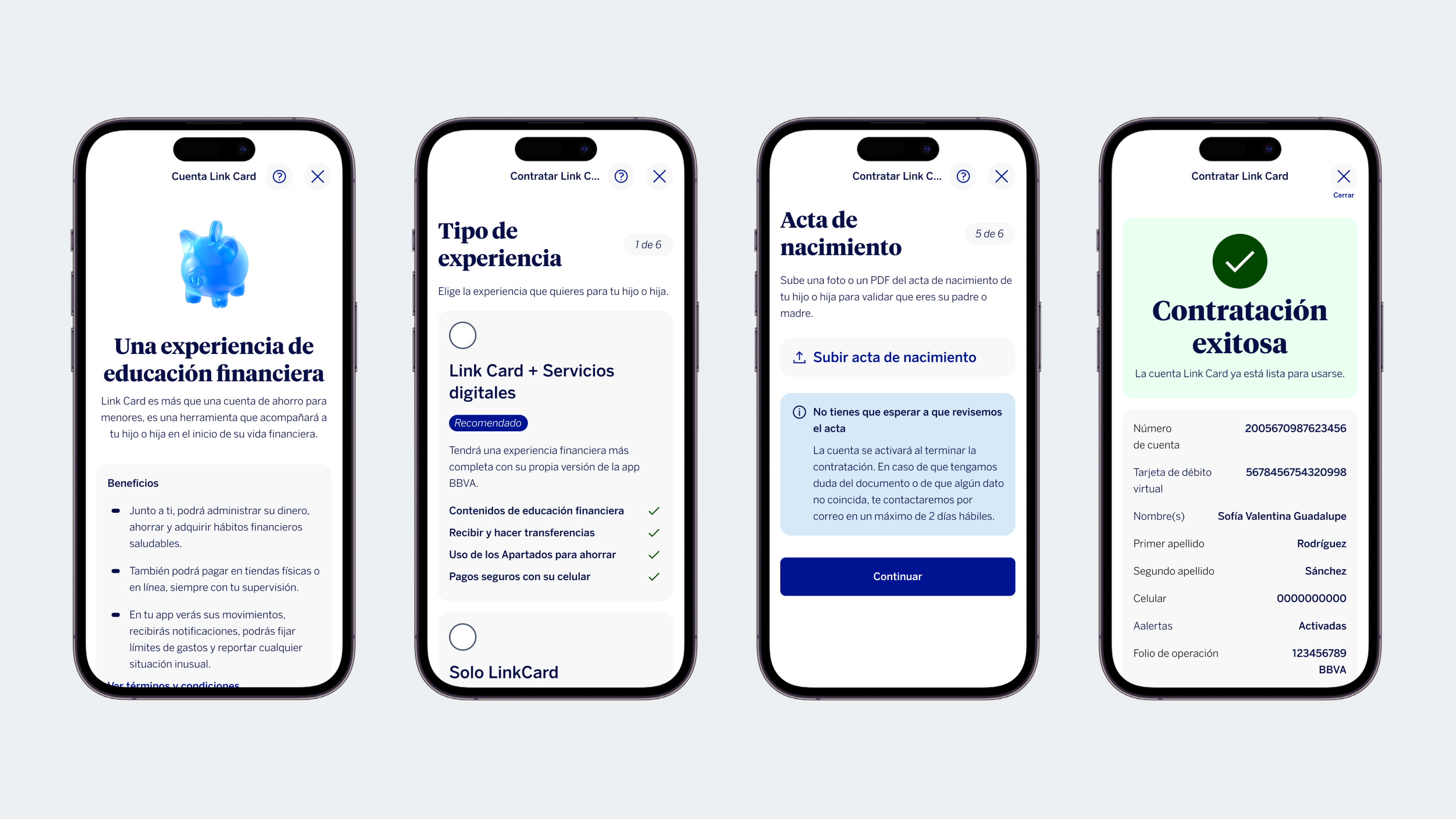
We landed on a middle ground: for efficiency, in the first phase (MVP) 90% of the features were adapted from adult accounts, on the agreement that new ones would be prioritized in later phases. A risk we accepted.
The challenge was holding the vision through later prioritization rounds, so that “adapting for the MVP” didn’t become “always adapting,” favoring speed over value for users.
Key learning
Leading doesn’t always mean having formal authority. Sometimes it means having the right evidence and knowing the right moment to use it to influence a decision.
Leading without being asked to
When the project got greenlit for development, the team grew: we went from 2 designers to coordinating a team of 7 profiles:
4 product designers
1 content strategist
1 service designer
1 behavioral economics consultant
I took on an informal leadership role, guiding strategic decisions, facilitating workshops and shaping design and prioritization criteria among stakeholders.
One specific situation put me to the test: a task-assignment conflict broke out within the team while our design lead was on vacation.
It wasn’t my place to reassign tasks, but I could open a conversation.
Instead of proposing a reassignment, I ran a transparency session: everyone shared their current workload and what they could take on, so we could reach clear agreements. What mattered most was keeping the dialogue open and repairing the working relationship before it escalated.
Impact
The evidence that contradicted the design system
Throughout the project, we continuously tested our ideas in sessions with users. We ran concept tests to validate perceived value, then usability evaluations for each feature.
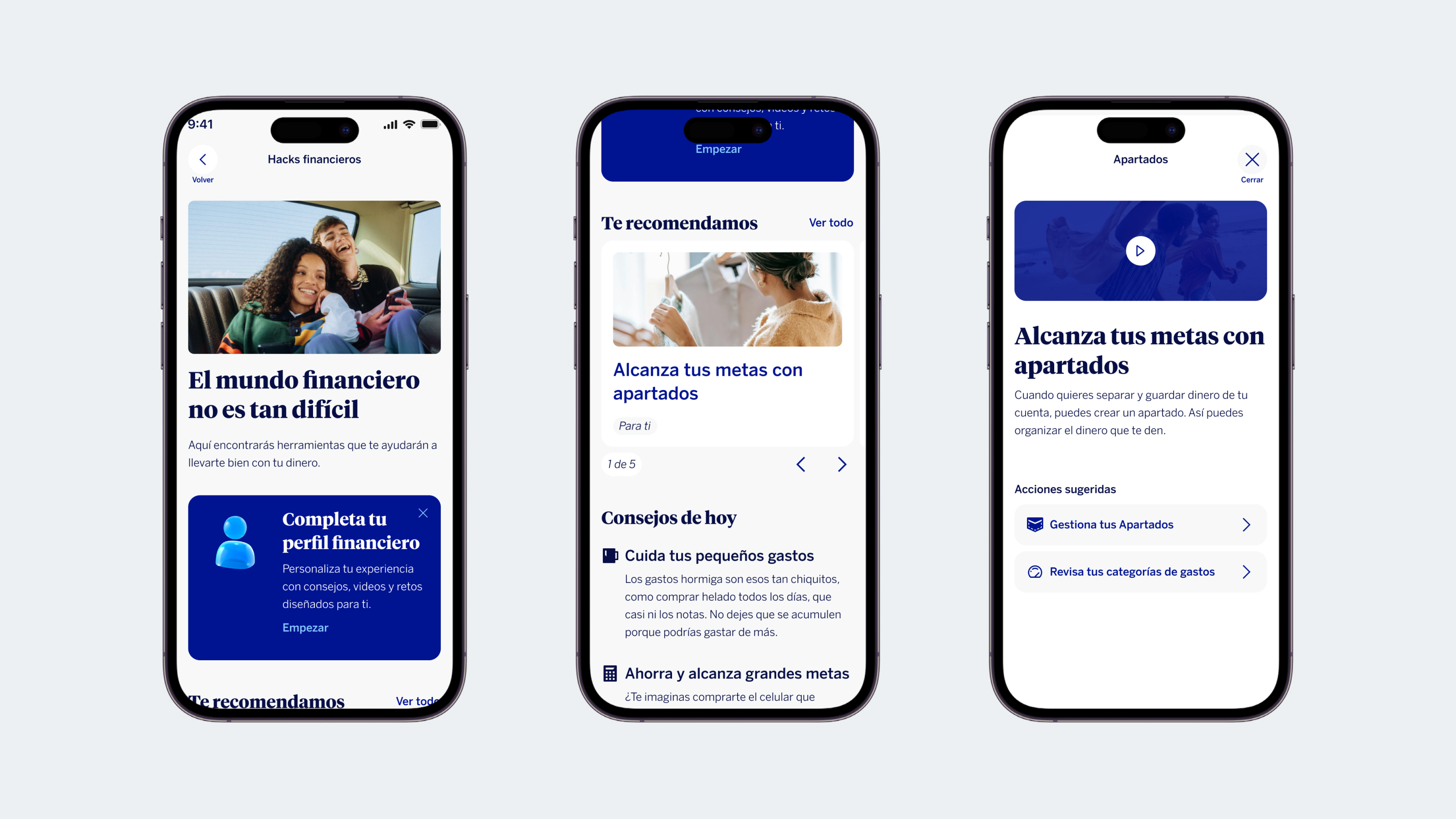
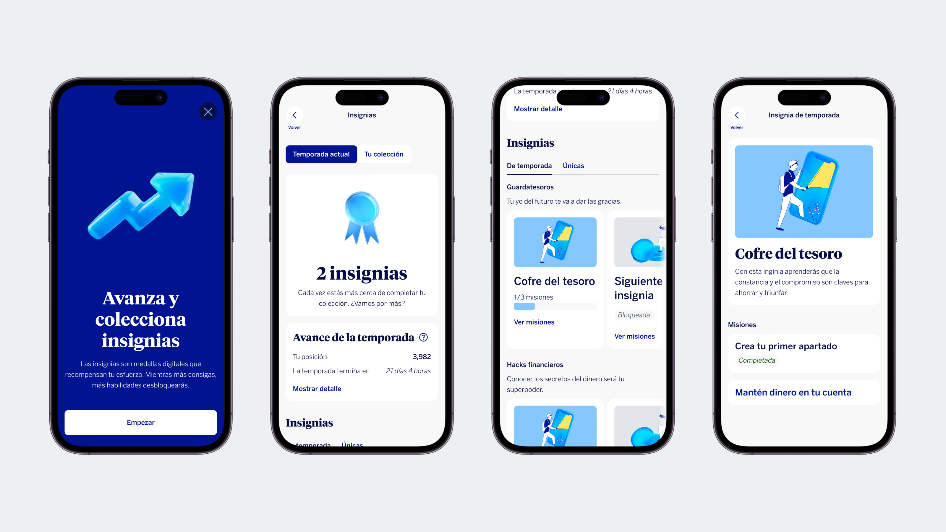
When testing the app, minors described our visual and text language (aligned to the global design system) as “boring” or too “grown-up,” distant rather than empowering.
—“This looks like it’s for my dad.”
The evidence forced us to negotiate on three separate fronts, each with its own logic:
01
With the global design system team
To authorize more dynamic compositions and new illustration uses outside the current standard
02
With marketing
To co-build a new communication guide aimed specifically at teenagers
03
With legal
To authorize the product speaking directly to the minor, since even as the account holder, they can't manage their assets without parental guardianship
The last one was the hardest: it meant reconciling the voice of a product built for teenagers with a legal framework that holds parents responsible for those assets.
User-centric results
The results were very positive: +1 million new accounts opened after launch.
The new product fits real family dynamics
Increased perceived value and intent to use
Became the centerpiece of the 2025 marketing strategy